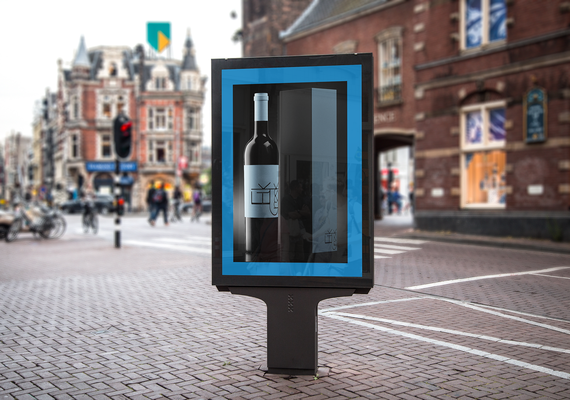
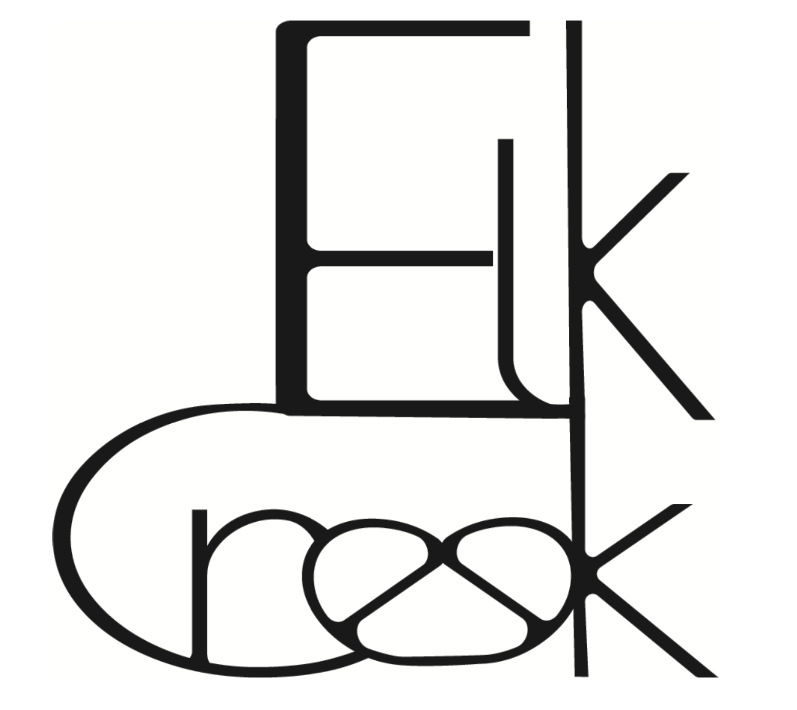
This logo and packaging were created to appeal to an audience of young adults that are starting their adventure into the world of more upscale wines, that love to share the experience of something new and adventurous for a special night out with friends. The smoothness of the lines gives a feeling of sexy or sensual feel and when intermingled with the sharper edges it gives the social aspect, as if the letters themselves are mingling together. The continuous feel between each letter gives the consumer a feel of fluidity, elegance and uniqueness.