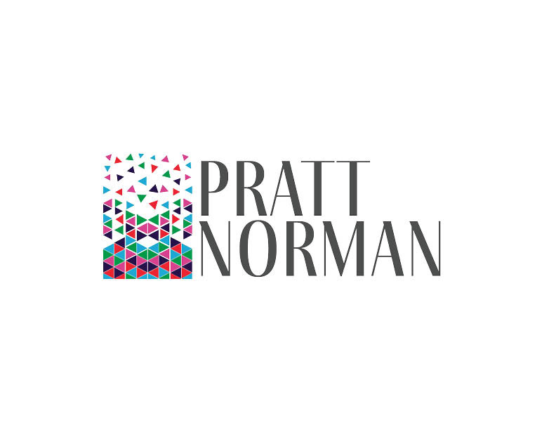
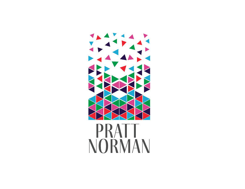
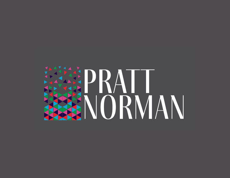
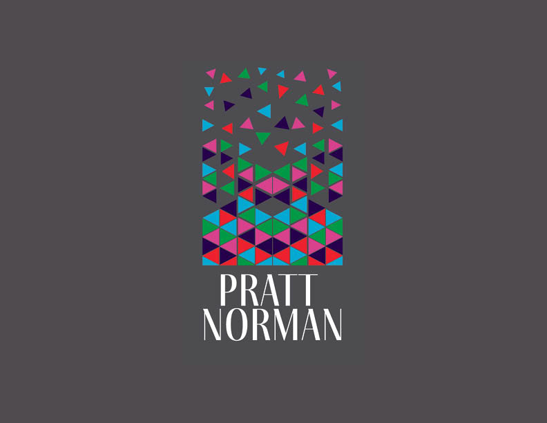
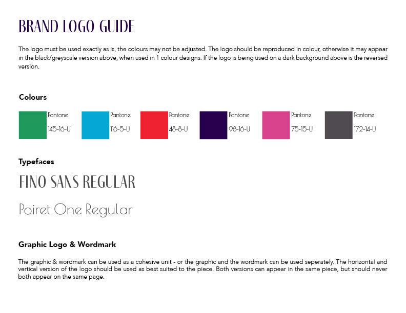
Pratt Norman is the firm you come to as a creative, one you can trust that they will ensure every important piece is attended to and falls into place. The graphic is based upon this, having each colour represents not only the broad base of clientele that Pratt Norman is devoted to, but they also represent the core values of Pratt Norman’s identity:
Purple - Creative; Green - Down to Earth; Blue - Trustworthy; Red: Passion/Hardworking; and Pink - Stylish.
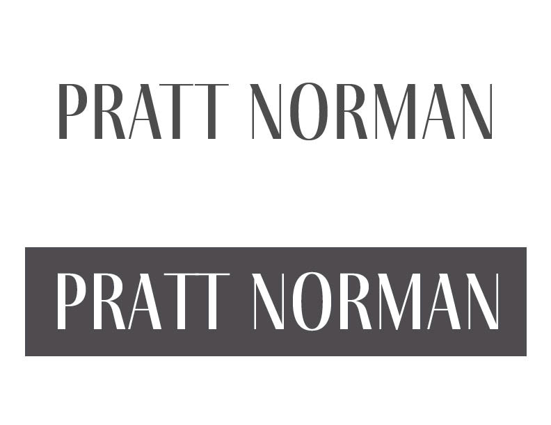
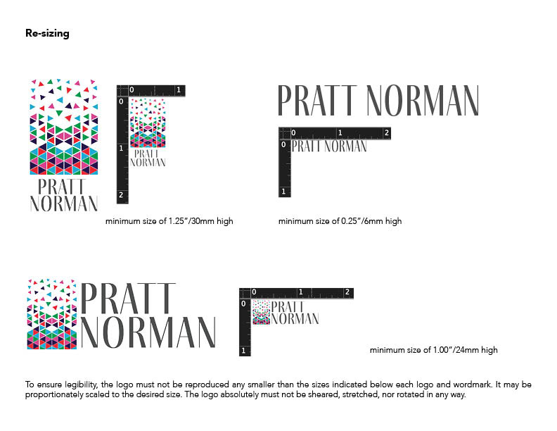
The Geometric style of the graphic speaks to the modern yet structured realiability of the firm. The wordmark also reflects this modern style, it is clean, structured and simple.
Our message: e are most proud of our artist and business development history. We are not afraid to roll up our sleeves and invest our significant resources into great ideas and great people. We’ve got you covered.